Websites are constantly evolving. Over the last few years, they’ve become faster, more functional and nicer to look at, and that last element is what we would like to discuss today. Let’s have a look at the seven most interesting graphic trends you can employ on your website in 2022 and beyond.
Of course, there are many ways to create a memorable website for your business. You should pursue the idea that you feel comfortable with; after all, it’s your website, and it should reflect your personality or brand’s essence.
However, if you’re about to design a new website, it’s worth checking what current web design trends are. Perhaps you’ll find something that fits your vision. And if you don’t have a specific vision yet, analyzing these trends can help you find it or at least narrow it down.
We’ve listed seven graphic design trends. If you go to other websites, you will surely find many more. We wanted to focus on universal trends that are relatively easy to implement, even for a company with a small budget.
Trend 1: Typographic hero images and oversized typography
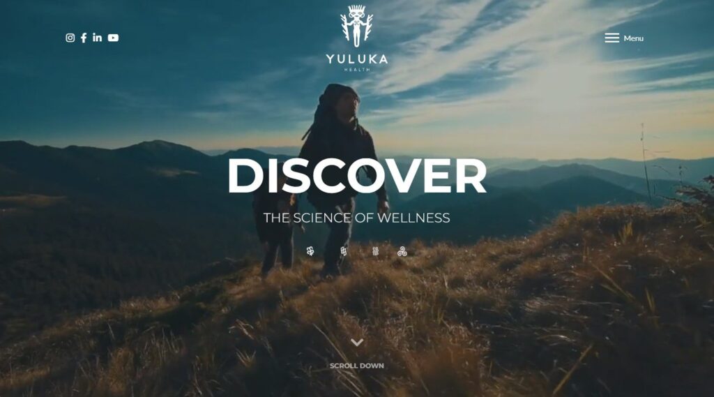
Typography has always been a crucial element of almost every graphic design. In 2022, it’s everywhere, especially on hero images. If you’ve never heard that term, a hero image is the main oversized banner image that’s always located at the top of a website. Perhaps you’ve noticed that they’ve become more textual lately. Here’s a good example:
It doesn’t mean that your hero image should have no photos, but they should be somewhat in the background, so they complement the design and do not distract the viewers. This way, you can focus on the content.
Trend 2: Creative fonts
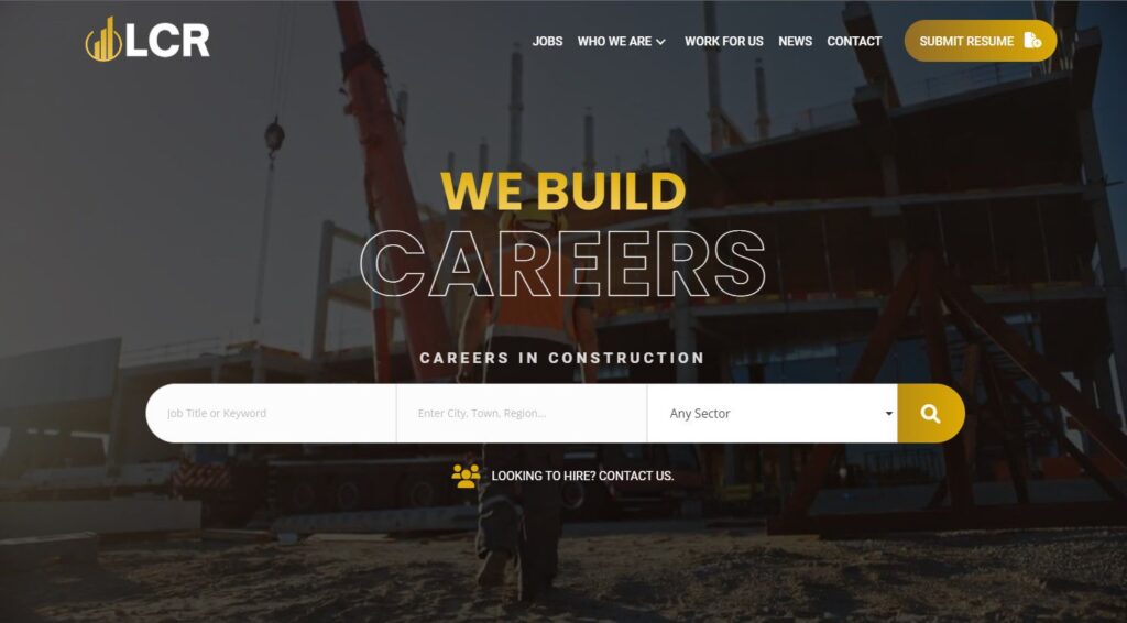
How do you define “creative”? For us, it’s everything that breaks the common standards. Play with your fonts, especially those in the logotype and in the hero image – change their size, colours and layouts. Make some letters upside down, smaller or bigger, remove or cut them, and animate them if you want. Only your creativity limits you. Take a look at this job board website we created. The hero image features an animated heading with the words only displayed using an outline.
Trend 3: Abstract and hand-made illustrations
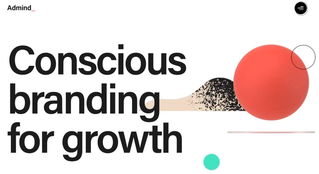
If you are creative and want your website to be unique, you might want to order hand-drawn illustrations for your website. You can also go with an abstract design or combine these two trends. The thing about abstraction is that there is no one correct way of reading it. Abstract design can be a good idea for a company/professional providing creative services, e.g., photography, copywriting, 3D illustrations, branding, etc.
And speaking of branding, that’s what Admind, one of the European branding agencies, decided to do on their website. Here, we also see a good representation of the first trend:
Trend 4: Glassmorphism/Bokeh
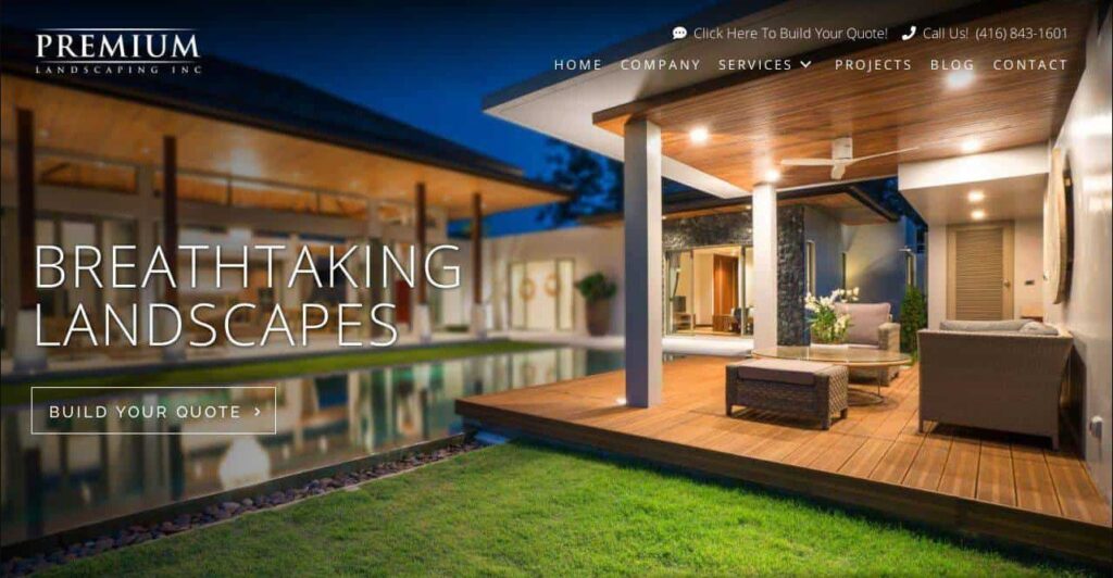
Do you like glass elements? That’s what glassmorphism is all about. It’s a combination of transparency and sometimes also bokeh that enables designers to achieve a glass-like effect. Here, you also can play with this graphic design trend and think of glass 3D elements or opt for a frosted or milky glass effect. Glassmorphism looks particularly good on mobile screens. Take a look at this example:
The picture in the background is partly blurred, thus creating a nice effect on the button on the main page. Discover more information about this web design project for a landscaping company.
Trend 5: Candy colours
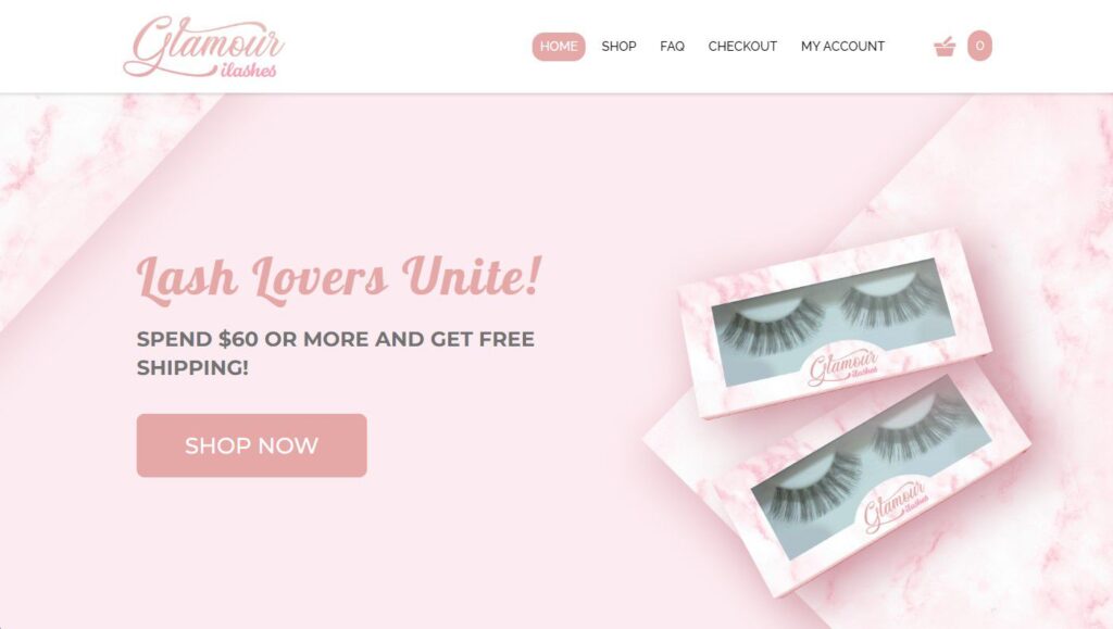
Candy (or sugary) colours can create a cozy, friendly atmosphere around your website. If you want to appeal to your customers’ inner children, that’s the way to go! After all, we all would like to go to a fairy tale dreamland, wouldn’t we? Candy colours are useful if you want to offer, for example, beauty, decorating, or children-related products and services. See how our client, Glamour Ilashes from Toronto, used this trend on their new e-commerce website:
Read more about this e-commerce web design project.
Trend 6: 3D characters and elements
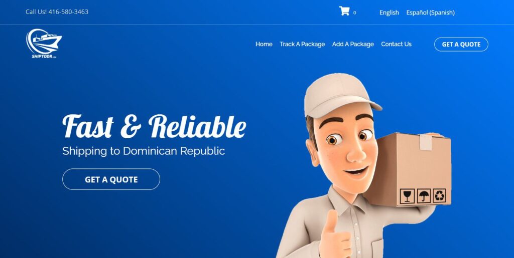
3D is still a thing! Nowadays, web and graphic designers like to mix 2D and 3D elements as well as create 3D characters. Most likely, it has a lot to do with the growing popularity of virtual reality that’s full of such 3D characters. What’s interesting about this trend is that almost any company can use it in its marketing materials. They make the website feel more fun and personal. If you’re not against casual communication, perhaps that’s the idea for you! Even if you run a logistics company:
Trend 7: Geometric shapes
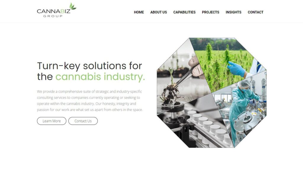
There is something elegant about geometry and symmetry, isn’t there? Geometric shapes are easy to create, minimalistic and universal. They work very well with other elements, so there is no risk that they will dominate your website and make it illegible. As we showed in the third trend, geometric shapes can work well with other hand-made or abstract elements. That’s what our Client, Cannabiz Group, wanted on their website:
In fact, their entire website is made this way, not just the main banner. Read more about this web design project.
Summary: Follow trends but not at any price!
In general, observing trends is always a good idea. It helps you stay on top of things and see how the market is changing (and it’s changing rapidly!). However, you have to find the perfect balance when it comes to web design. Remember that website is, above all, a business tool. As such, it should help your customers or users get what they need.
That said, your website ought to be well-organized and legible. If you turn it into an exaggerated work of art that no one understands, it certainly won’t help your company grow. So, we suggest you observe trends and try to implement the ones you like, but not at the price of hurting your business. For instance, if your website is full of heavy graphic elements and animations, it will take longer to load and respond, and that’s a big problem from the SEO perspective.
If you want to build a website that works on both fronts, we’re happy to help. See our website design services and drop us a line today!


